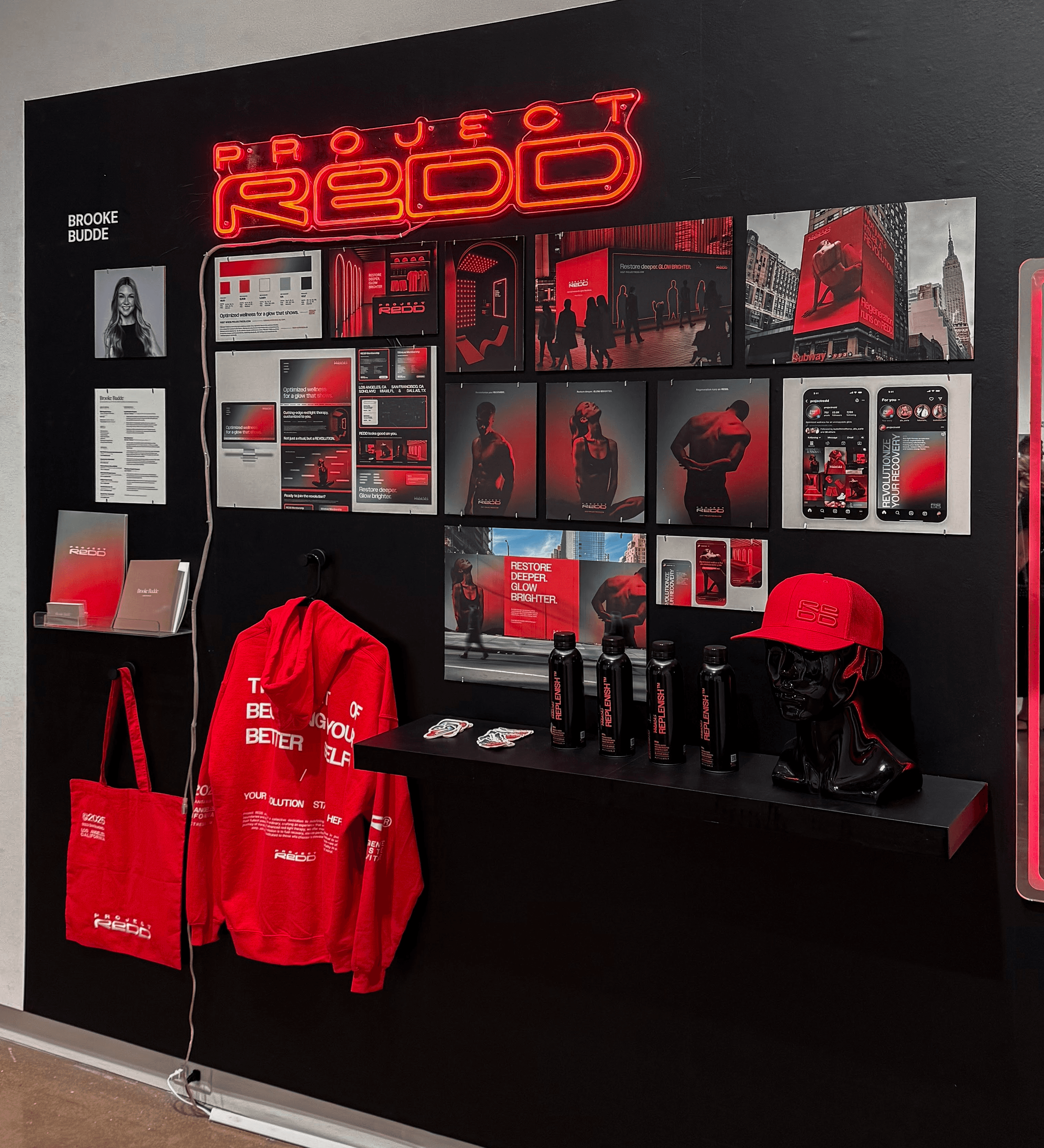
Project REDD
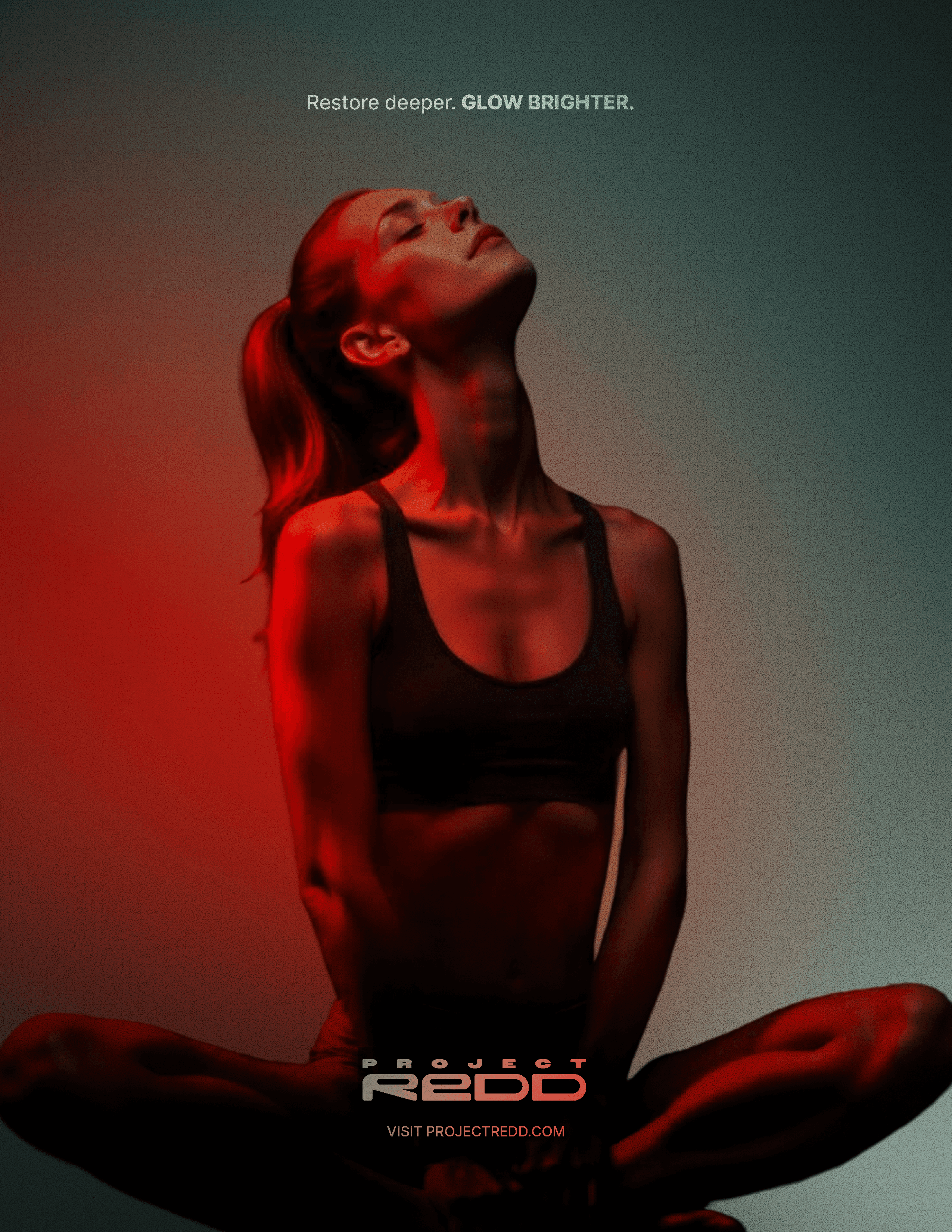
Project REDD is a disruptive red light therapy studio positioned at the intersection of science, luxury, and high performance.
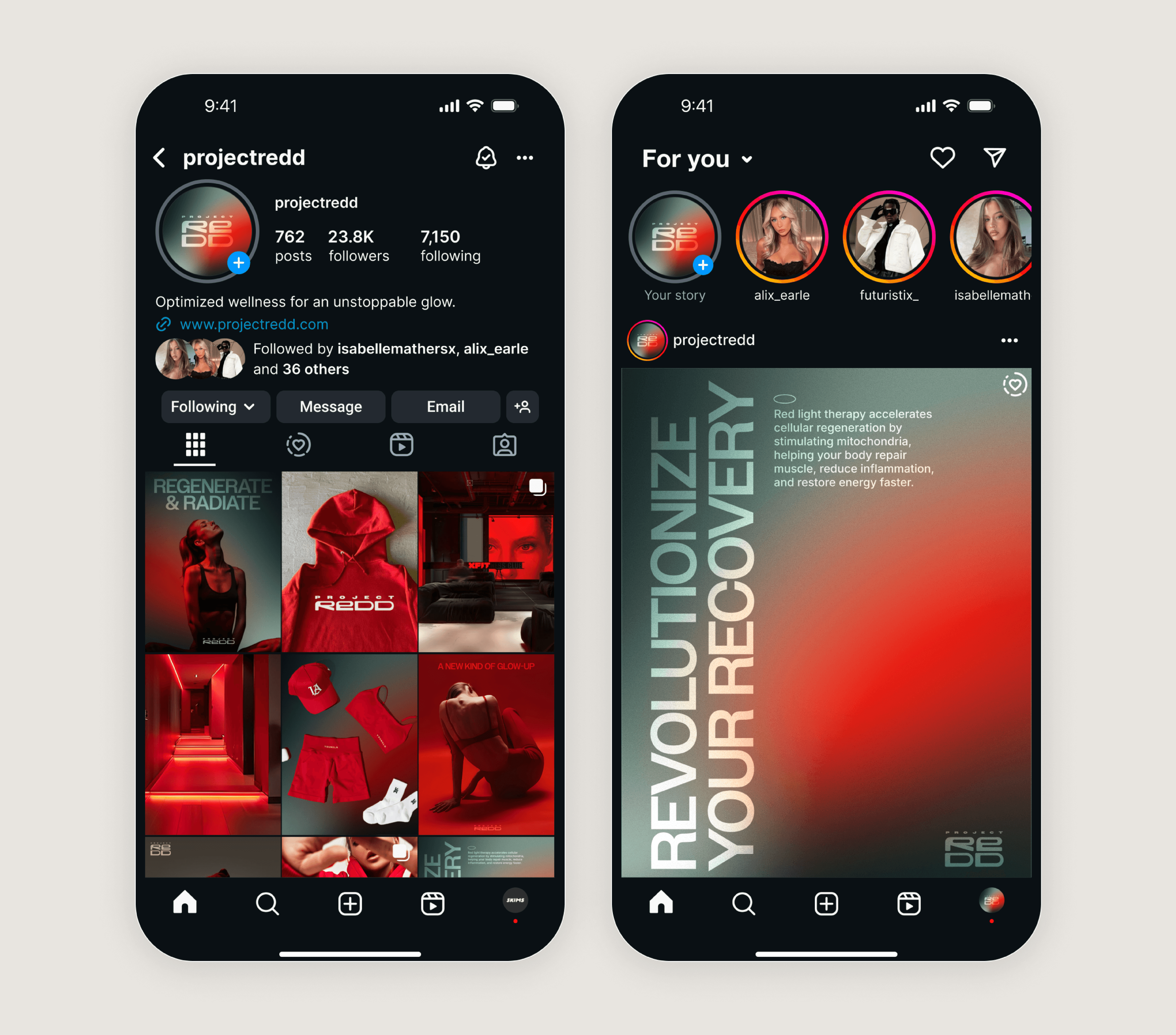
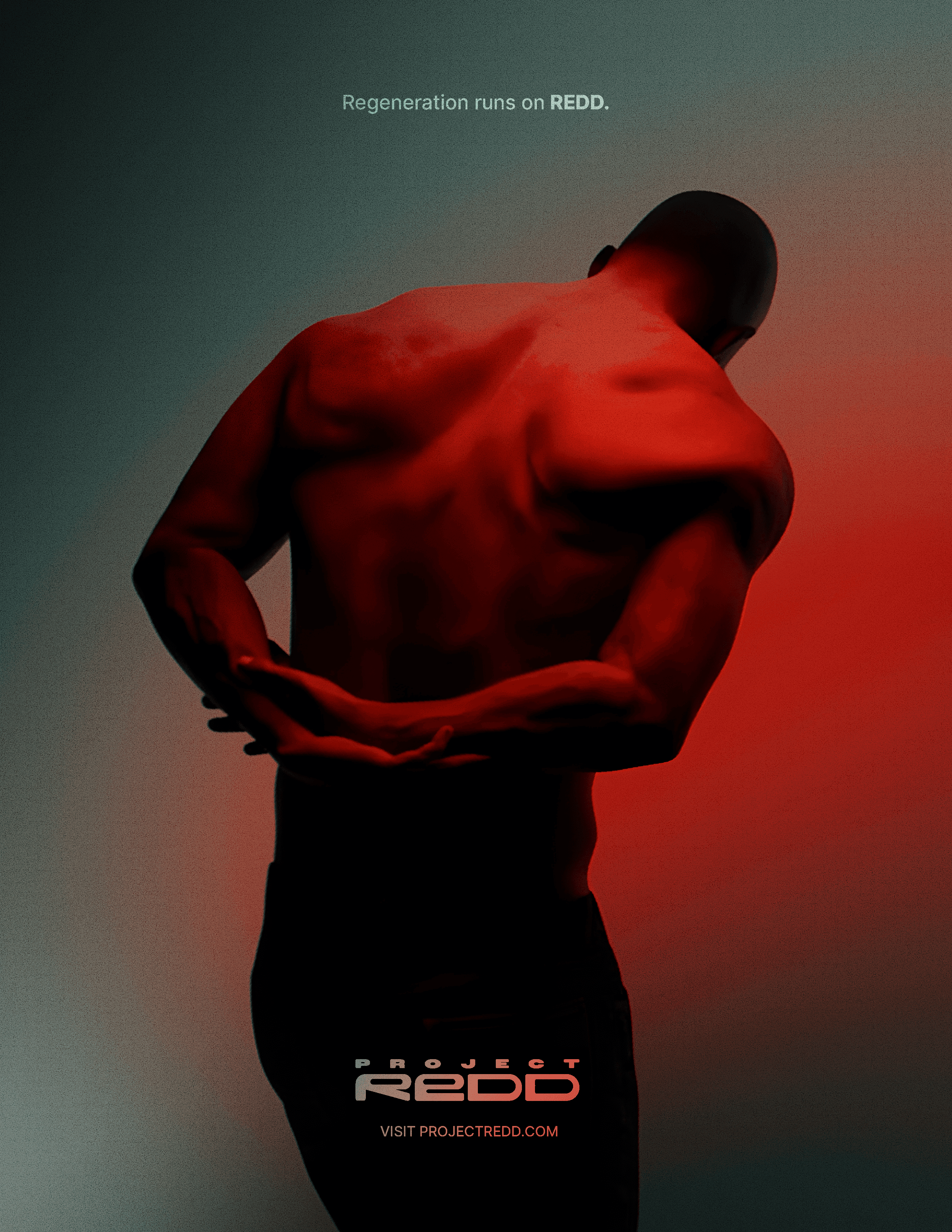
Grounded in the physiology of cellular regeneration, the brand reframes recovery as bold and culturally relevant rather than passive or spa-like. The visual system rejects the muted, nature-driven language common within the wellness industry in favor of a charged, science-forward identity.
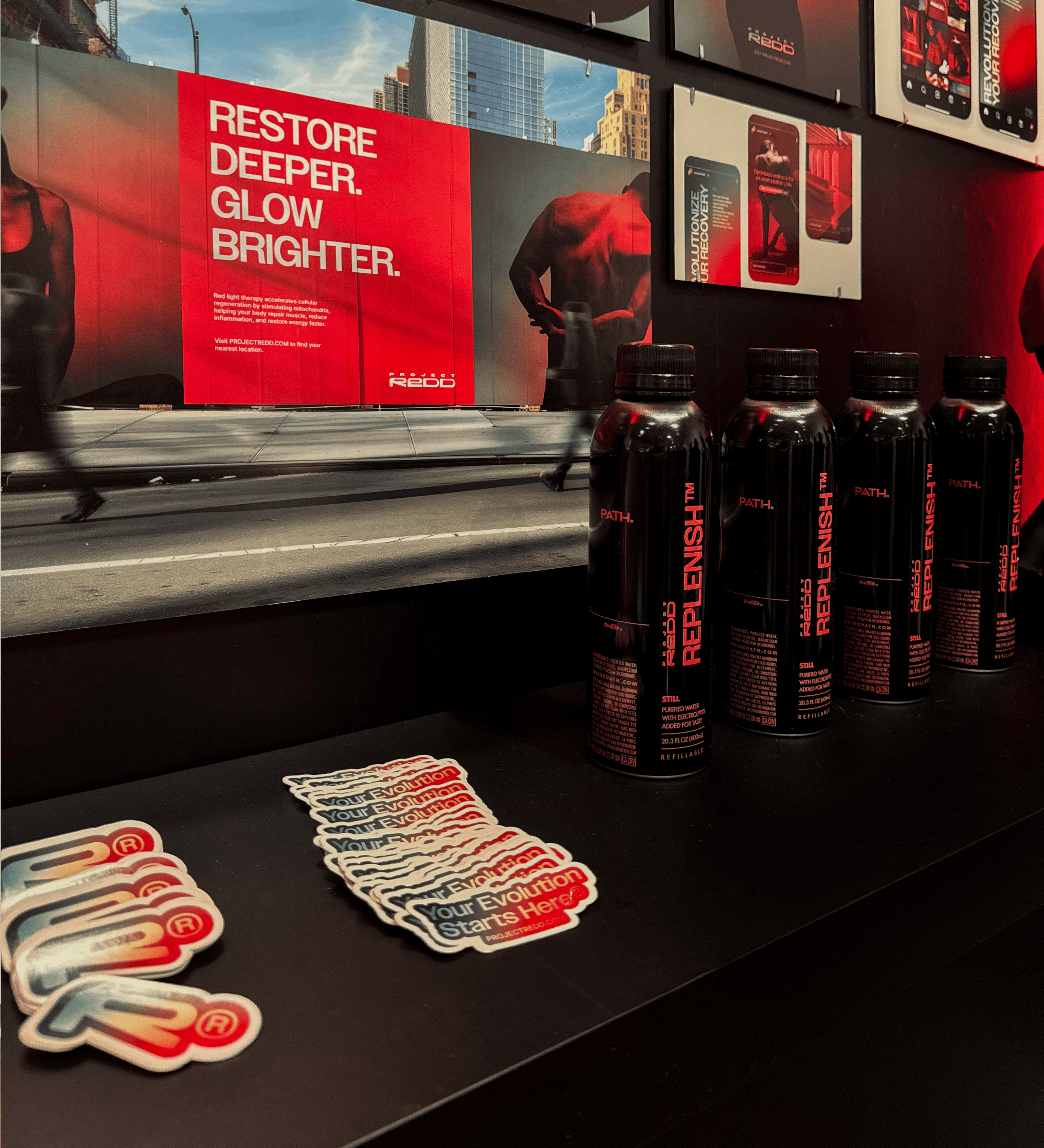
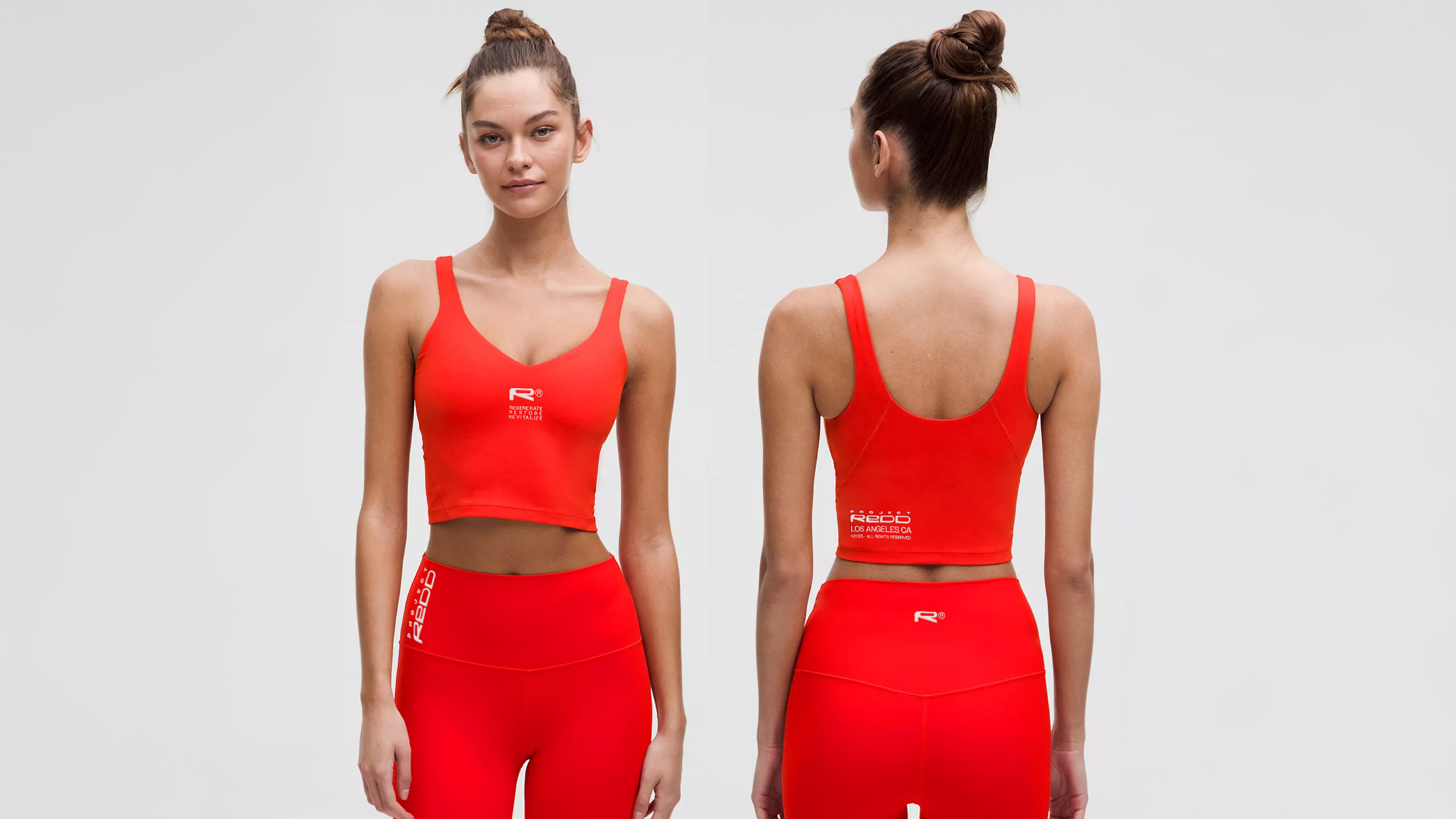
The custom logotype draws from the structure of human cells, with tightly constructed forms that suggest density and internal energy. A gradient-led color system transitions from activation to recovery — saturated reds dissolving into deep, controlled neutrals — visually expressing transformation at a cellular level.
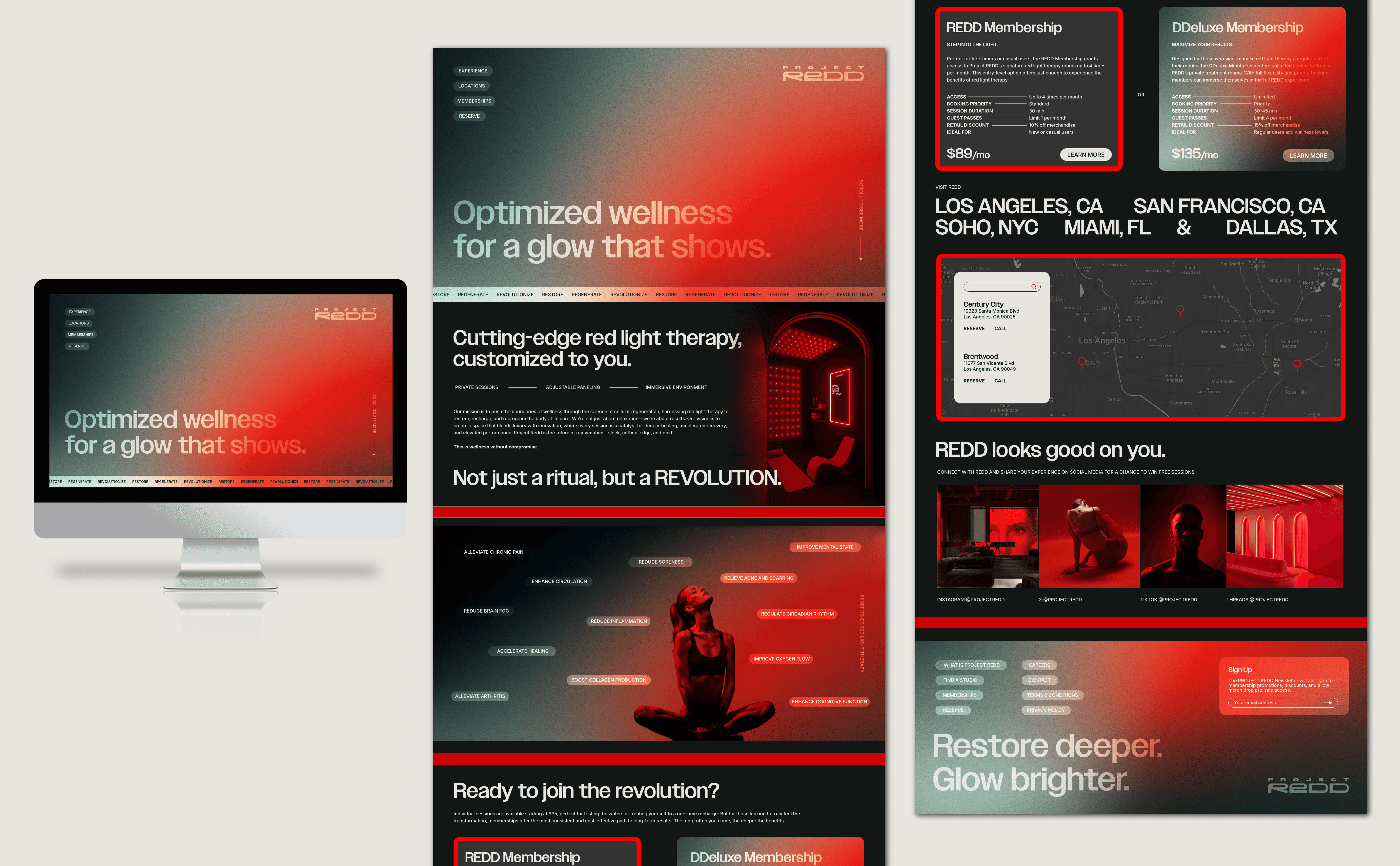
The brand extends across print advertising, social campaigns, digital platforms, and a lifestyle-driven apparel line, positioning Project REDD as more than a studio — but as a movement built around performance, autonomy, and measurable results.
Project REDD was developed as my capstone project at TCU. For further insight into the research, creative direction and strategy, please see the branded essay booklet below.
Client
Conceptual Work
Project
Branding, Advertising
Year
2025
Scroll down